Configuring Axes Settings
- 20 Sep 2023
- Contributors


- Print
- DarkLight
- PDF
Configuring Axes Settings
- Updated on 20 Sep 2023
- Contributors
- Print
- DarkLight
- PDF
Article summary
Did you find this summary helpful?
Thank you for your feedback
Configuring Axes Settings
Axes settings provides options for configuring the display of labels and divisions along both the X and Y axis in the chart. To configure these settings, click the Axes Settings button on the toolbar, and select the desired option.
NOTE: The options only apply to Bar (vertical and horizontal), line, and point charts.
Axes Settings Options
Option | Description |
|---|---|
Y Axis > Grid | Adds horizontal grid lines that run across the chart to mark each interval on the Y axis. NOTE: This option is also available via the Y Axis tab in the Properties window. Refer to Configuring Y Axis Properties for more information. |
Y Axis > Interlaced | Adds an interlaced background for the chart (alternating bands of shading that appear behind the chart elements at each Y axis interval). NOTE: This option is also available via the Y Axis tab in the Properties window. Refer to Configuring Y Axis Properties for more information. |
Y Axis > Multiplier | Opens the Multiplier Window, where you can apply a multiplier (for example, change the label to read 10M instead of 10,000,000) to Y axis labels. |
X Axis > Grid | Adds vertical grid lines that run across the chart to mark each interval on the X axis. |
X Axis > Vertical Labels | Sets the labels on the X axis to read vertically instead of horizontally. This is useful if, for example, you have long labels that may overlap each other if they are horizontal. |
X Axis > Staggered | Staggers the display of the labels on the X axis. The labels will alternate position, with each one displayed one line above or below the previous label. This is useful if you have long labels, but do not want to display them vertically. |
X Axis > Show Labels | Displays or hides the labels on the X axis. |
Options | Opens the Properties window with the Y Axis tab selected. Refer to Configuring Y Axis Properties for more information. |
Configuring Multiplier Properties
- Click the Axes Settings button on the toolbar and select Y Axis > Multiplier. The Multiplier window opens.
Example: Multiplier Window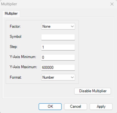
- Click the arrow in the Factor field and select the multiplication factor that you want to use: None, Million, Thousand, or Billion.
- In the Symbol field, enter the symbol that you want to use to represent the selected Factor.
NOTE: The system automatically populates this field when you select a Factor, but you can change it, if necessary.

- In the Step field enter the interval that you want to use to separate each amount or number label on the Y axis.
- In the Y Axis Minimum field, enter the minimum value you want to display on the Y axis of the chart.
- In the Y Axis Maximum field, enter the maximum value you want to display on the Y axis of the chart.
- Click the arrow in the Format drop-down box and select the desired format for the labels: Number or Currency.
- Click the Apply button to preview your changes.
- When you are satisfied, click OK.
NOTE: If you want to turn off the multiplier and return the labels to the default settings, click the Disable Multiplier button.
Was this article helpful?