Creating a Chart in Excel to Use in a PowerPoint Slide
- 16 Nov 2023
- Contributors


- Print
- DarkLight
- PDF
Creating a Chart in Excel to Use in a PowerPoint Slide
- Updated on 16 Nov 2023
- Contributors
- Print
- DarkLight
- PDF
Article summary
Did you find this summary helpful?
Thank you for your feedback
Creating a Chart in Excel to Use in a PowerPoint Slide
- Run the desired report in FIMS and save it as a data file (or run an export, which will automatically create a data file).
- In Microsoft Excel, click the Open button and select the data file. The Text Import Wizard opens.
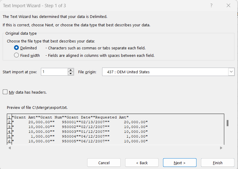
- In the Original Data Type section, select the Delimited radio button, and then click Next.
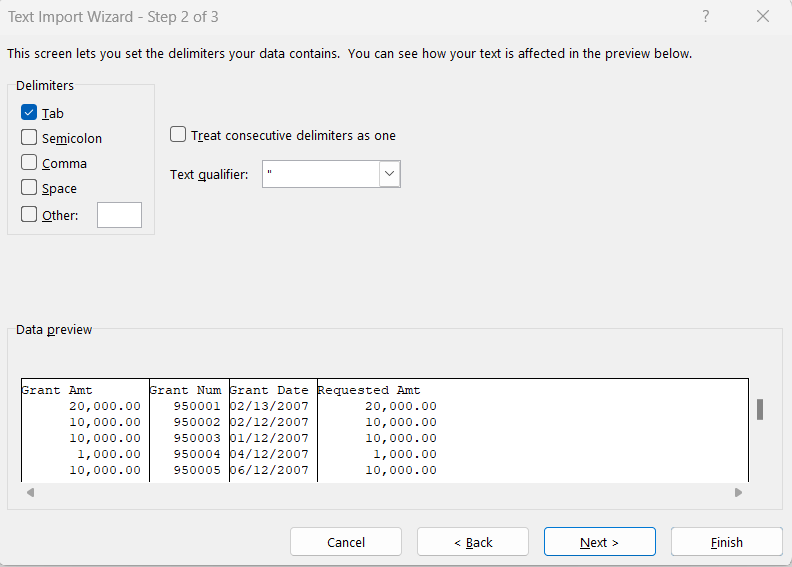
- Select the checkbox associated with the appropriate Delimiter (for example, Tab, Space, Semicolon, or Comma).
- Use the Data Preview section to verify that the selected delimiter will work properly, and then click Next.
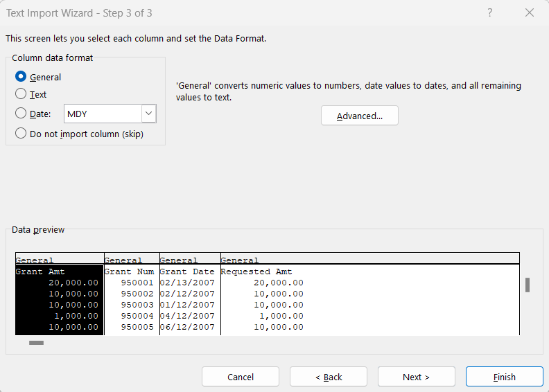
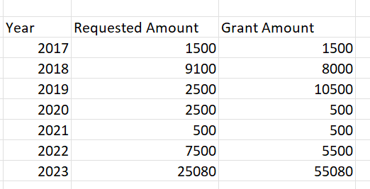
- Click Finish to open the data file in an Excel spreadsheet. A column was added to the exported data from FIMS to convert the Grant Date into a Year. To do this, insert a column next to the grant date and put the cursor in the cell next to the first value. Click on the Formulas Tab in the Ribbon. Choose the drop-down next to Date & Time and scroll down and click on Year. The Function Arguments window opens. Click the first Grant Date cell so that the cell value is displayed in the Serial Number field.
.png) Click Ok. The result is the grant year. Copy the formula to the end of the list.
Click Ok. The result is the grant year. Copy the formula to the end of the list.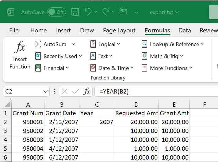
- Select the data area in the spreadsheet you want to include in the chart and then click the Insert Tab in the Excel Ribbon. Click on the chart type you want to create. For purposes of this chart, the requested amounts and grant amounts were totaled by year.
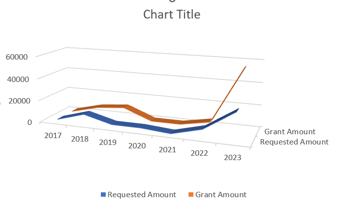
 Below are samples of a line chart and a 3D line chart.
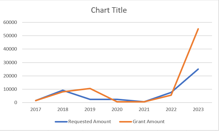
- Double-click on the Chart Title and update the title.
- Select the entire chart and click the Copy button on the Excel toolbar.
- Start PowerPoint and either create a new presentation or open an existing presentation.
- Click the Paste button on the PowerPoint toolbar to add the chart to the desired page.
- Click and drag the corners of the pasted chart to resize it without distortion, and then save the presentation.


.png) Click Ok. The result is the grant year. Copy the formula to the end of the list.
Click Ok. The result is the grant year. Copy the formula to the end of the list.
 Below are samples of a line chart and a 3D line chart.

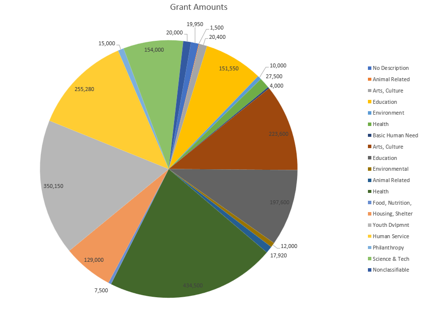
Automatically Creating Pie Charts from Trends and Analysis Reports (This feature is for on-premise FIMS clients only)
Most Trends and Analysis reports in FIMS have an Export to Excel option in the FIMS Viewer. When you click this option, FIMS automatically creates a pie chart in Excel. You can then change the formatting of the report, as desired and add the chart to a PowerPoint slide.
- In FIMS, run the desired Trends and Analysis report (for example, Trends & Analysis > Grant History, analyzed by Program Area).
- Click Export to Excel on the FIMS Viewer menu bar. Excel opens and presents the data as a chart.
Example: Trends and Analysis Data in Excel

- Format the chart as desired. For example, you can change the font size for the chart title and legend, change the format of the chart itself, and add labels.
- Save the chart.

Was this article helpful?