Data Tab
- 09 Oct 2023
- Contributors


- Print
- Dark
- PDF
Data Tab
- Updated on 09 Oct 2023
- Contributors
- Print
- Dark
- PDF
Article summary
Did you find this summary helpful?
Thank you for your feedback!
Data Tab
The Data tab allows you to select the data that you want to chart, use for grouping and group display, and / or comparison.
For every selected data field, you much also select a Calculation type (e.g., average, count, maximum, minimum, or total). You can also select whether to chart the data based on all records in the Data Grid, or just the tagged records.
NOTE: This tab contains all the essential selection options for a chart. For a basic chart, it is not necessary to select any of the other tabs.
Example: Data Tab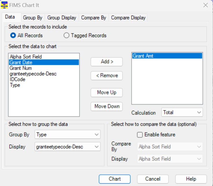
Field | Description |
|---|---|
All Records | Select this option to chart all records in the Data Grid. |
Tagged Records | Select this option to chart just tagged records in the Data Grid. |
Select the Data to Chart | Located on the left-hand side of the window, this pane contains a list of all the data fields that are available for charting. |
Selected Data | Located on the right-hand side of the window, this pane contains a list of all the data fields that will be included in the chart. |
Add | Adds the selected data field to the Selected Data pane, indicating that it will be included in the chart. |
Remove | Removes the selected data field from the Selected Data pane, indicating that it will not be included in the chart. |
Move Up | Moves the selected data field up in the list of Selected Data. The first data field in the list becomes the first “series” in the chart. The second data field becomes the second “series”, and so on. |
Move Down | Moves the selected data field down in the list of Selected Data. |
Calculation | The list of available aggregate functions for the selected data field. Available functions include Average, Count, Minimum, Maximum, and Total. NOTE: This list varies depending on the type of data in the selected column. |
Group By | The data field that you want to use to group your data in the chart. You can choose any field that is part of the Data Grid you used as the basis for the chart. NOTE: When you select a data field to Group By, the Display (Group) field is automatically populated with the same selection, but you can change it, if necessary. |
Display (Group) | The data field that you want to use for the chart’s X-axis display values. NOTE: The selected data field is the same as that in the Group By field by default, but you can change it, if necessary. |
Enable Comparison | Select this checkbox to enable the Comparison feature for the chart. NOTE: If you want to enable the Comparison feature, you can only have one field in the Selected Data pane. |
Compare By | The field that you want to use to compare the data in the chart. NOTE: When you make a selection in this combo-box, the Display (compare) combo-box changes to the same selection, but you can change it, if desired. |
Display (Compare) | The data field that you want to use for the chart’s X-axis display values. When you use the comparison feature, each value on the X-axis is segmented based on the Compare By field. This display option determines how you wan the segments displayed. NOTE: The selected data field is the same as that in the Compare By field by default, but you can change it, if necessary. |
Was this article helpful?