Power BI User Guide
- 24 Mar 2023
- Contributors

- Print
- Dark
- PDF
Power BI User Guide
- Updated on 24 Mar 2023
- Contributors
- Print
- Dark
- PDF
Article summary
Did you find this summary helpful?
Thank you for your feedback!
Power BI is full of new features and ways to view data. This guide highlights some of the features and how to use them.
Interacting with Visuals
Interactive visuals are one notable feature with Power BI.
Visuals are displayed as read-only. Changes made by applying filters or other visual manipulation only apply to the current instance of the report and are not saved.
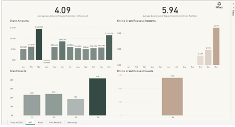
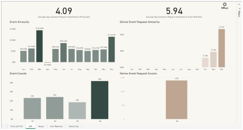
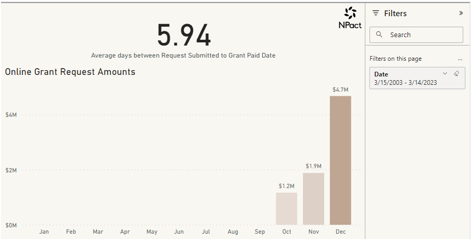
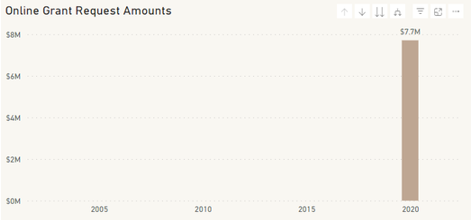
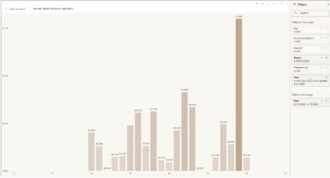
For example, highlight October on the Donor Advised Fund visual to see how that month’s Online Grant Requests affect the Quarter. Click on the Oct bar in the Online Grants Request Amounts visual and it automatically filters the other visuals on the page.
The ability to filter data is a powerful feature in Power BI.
Some reports use a slicer and usually apply to one or two visuals on a page. Some, like the Donor Advised Fund page, use a filter that applies to the whole page.
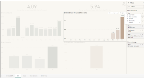
Hover your mouse over a visual and click on the funnel icon to determine how visuals are currently filtered and sliced.
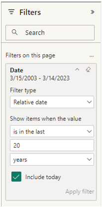
Slicers come in several varieties. The two varieties available are the sliding slicer and the date window slicer.
To use the sliding slicer, slide the selector along a bar corresponding to year values or enter a year value in the display window instead.
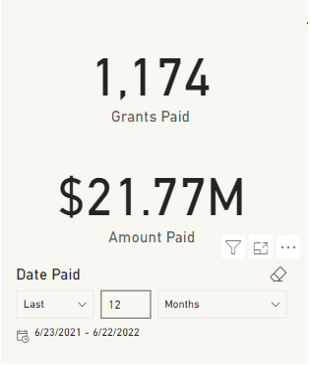
The data window slicers affect multiple visuals on the Grant Payments page and are slightly more flexible than the sliding slicer. The first option determines the timeframe.
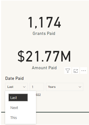
Select the timeframe listed in the third option.
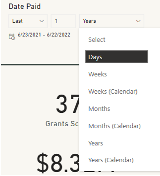
Use the second option to determine the exact length of the timeframe selected.
Filters and slicers perform a similar role, but slicers do not display on the Filter tab. Use the funnel icon to determine which visuals are affected by a slicer.
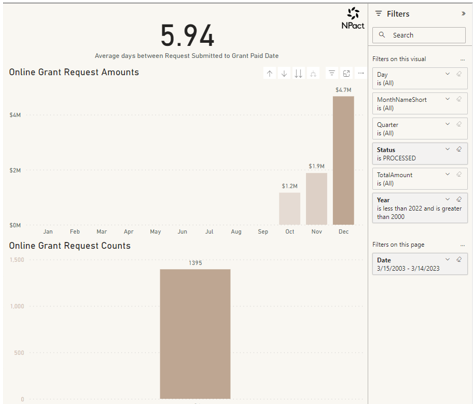
The filter settings display on the right side of the page. Click to expand the Filter tab.
When no visuals are selected, the Filter settings only display page filters. Page filters apply to all the visuals on the page.
Filters contain more settings than slicers and are configured by expanding the individual filters.
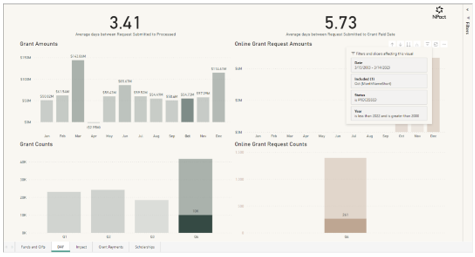
Click on the Online Grant Request Amounts visual to view all the currently active filters. Expand each one to edit.
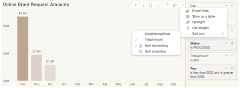
Some visuals have the option to expand or shrink data. Click on the up and down arrows to change how the data is displayed.
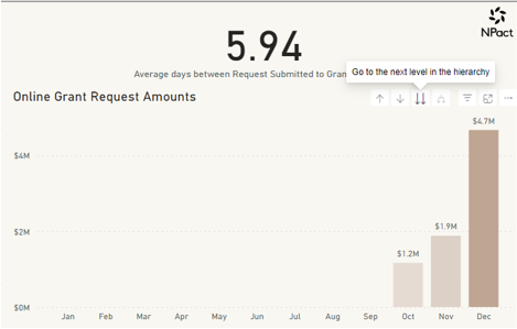
For example, in this visual, drilling up changes the ‘x’ axis of the graph to years instead of months. Drill down from months to display the data by day of the month.
The last tool for drilling is Drill Mode. Click the single down arrow to activate drill mode. Then click on a data point to drill into it. Notice the active filters.
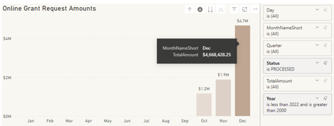
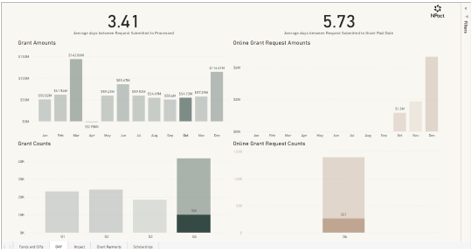
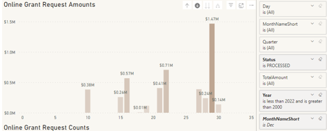
In this example, click on the December column to apply an additional filter to the visual.
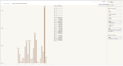
Another viewing option for visuals is called Focus Mode. Click this button to expand the visual to fit the size of the page.
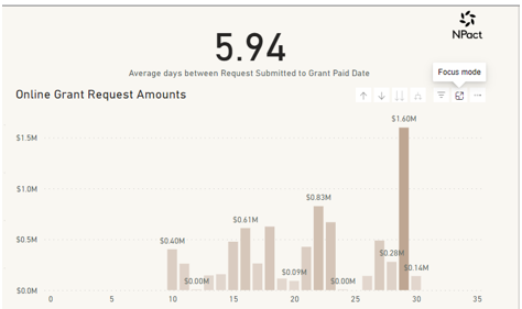
This is useful for digging into visually busy graphs because this viewing mode still allows access to the filter and drill down menus.
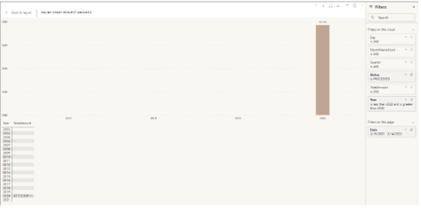
A similar viewing mode is accessed from the More Options menu, Show as a Table.
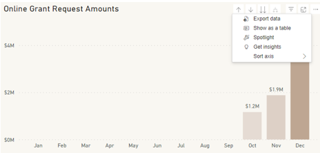
This expands the visual to fit the page and leaves room for the data to display in a table format.

The data displayed in the table depends on how the visual is configured.
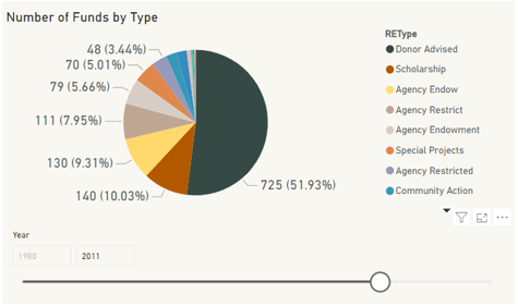
In this example, the visual is drilled up to years and displays the table in year format.
Here is an option only available in this mode. This button changes the visual from a vertical or horizontal layout.
The Spotlight option pops the visual out from the page and obscures the other visuals on the page while keeping its original size and position on the page.
The Sort axis is used to configure the orientation of the ‘x’ axis depending on the data present.
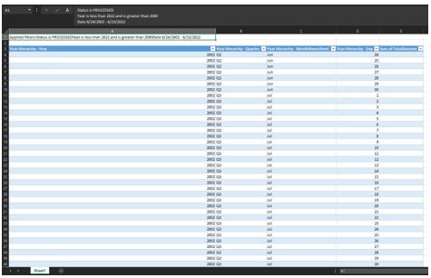
The Export data button takes the base data in use to create the visual and export to either an Excel file or comma delimited file.
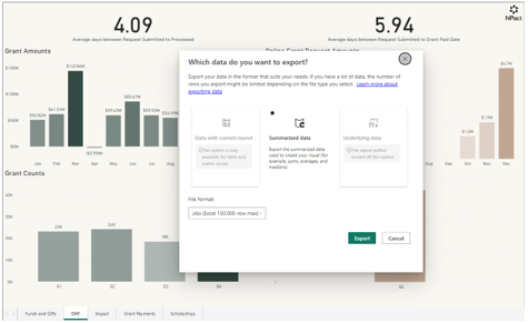
Best practice is to export in Excel format because the file comes formatted with a list of filters applied.
Power BI Paginated Reports
Power BI doesn’t change how paginated reports work. However, a few extra features make sharing reports easier.
One of the first things to note when opening a Power BI paginated report is that it pops up a new modal instead of creating a new tab in the web browser.
Several different viewing options are available in the Power BI paginated reports.
Print Layout, Export, Parameters, and Print are all available features.
View has two options, Web Layout and Print Layout.
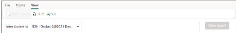
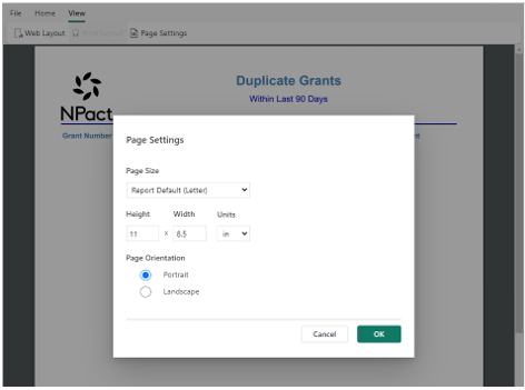
Print Layout is useful to see what the report will look like when printed. Page Settings can be modified to suit printing needs.
Note: Page Settings are only available when viewing the report in Page View.
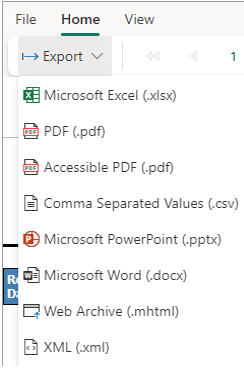
Home has two options: Export and Parameters.
Several export options are available for reports. PDF format is recommended but other file formats are available, if needed.
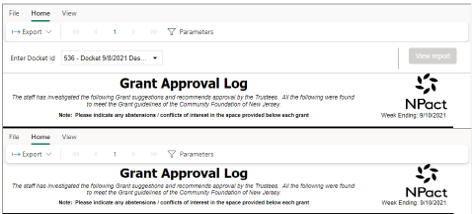
If the report has parameters, a Parameters option displays. Click this button to hide or show the parameter selection and report refresh section.
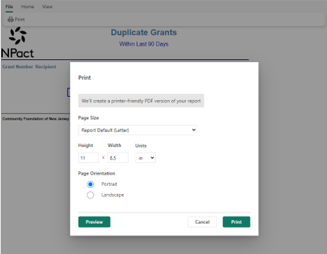
Print option is located under the File menu. Click to open a print modal.
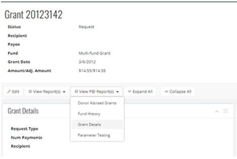
Reports can be added to record screens, so the report displays in a modal on that screen. If the report has a parameter that corresponds to that record, the parameter automatically populates with the records's information.
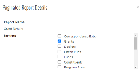
To add a report to a screen. go to Reporting>Power BI Paginated Reports and click Edit.
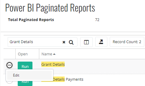
Select the screens to display the report on and click Save.
When reports are added to the record screen, the option to View PBI Report(s) displays.
Was this article helpful?